A brief about the released version of this API is available here.
As a part of the last semester of my graduation program (Bachelor of Engineering in Information Technology), I have been interning with a start-up, namely uTrade Solutions. uTrade™ Solutions is a financial trading technology company with various products including multi-asset trading platform, algorithms and analytics. Instead of walking through my experience of working in a start-up, I would directly move to a short discussion about my project.
As a part of the last semester of my graduation program (Bachelor of Engineering in Information Technology), I have been interning with a start-up, namely uTrade Solutions. uTrade™ Solutions is a financial trading technology company with various products including multi-asset trading platform, algorithms and analytics. Instead of walking through my experience of working in a start-up, I would directly move to a short discussion about my project.
uTrade Solutions is working to develop a financial analytics portal and every financial analytics portal employs the use of advanced charting. To draw and display different types of charts on the web, there are two main options which are widely used and acknowledged. Namely, Adobe Flash and Scalable Vector Graphics (SVG) .
Using Adobe Flash has two main disadvantages:
- It requires the installation of an additional plugin to run content on the browser.
- It is not compatible with any of the latest mobile operating systems. ( iOS and Android)
Hence, SVG was chosen to display charts on the uTrade Financial Analytics portal namely, Money uTrade. The API being developed by me, is completely using the JavaScript language and the Raphaeljs library. Raphael allows us to draw objects on the web browser in SVG (vector graphics), uses the SVG W3C Recommendation and VML as a base for creating graphics. This means every graphical object we create is also a DOM object, so we can attach JavaScript event handlers or modify them later. Raphaël currently supports Firefox 3.0+, Safari 3.0+, Chrome 5.0+, Opera 9.5+ and Internet Explorer 6.0+.
There are a couple of charting libraries available which allow you to integrate charts easily on your webpage but the most notable one is the HighCharts. I have been looking at a custom implementation of the price series time plot using HighCharts as my aim to replace. The implementation has a basic part which allows the custom plotting of multiple charts on the same canvas and an advanced set of features which make the price series implementation highly interactive.
The basic release of my charting API includes drawing of five different types of charts:
- Line
- Area
- Bar
- Candlestick
- OHLC
It accepts an input object which provides all the parameters for drawing. The following features are included in the basic release which need to be defined:
- Placeholder - Name of the DIV which will hold the entire charting canvas
- Title - Text to be displayed as the header of the canvas
- Legend - Visual list of all the series which have been plotted in their respective color code.
- X and Y Axis with the following customizable features -
- dateFormat, if it is a time axis. It supports the date formatting by Steven Levithan.
- x and y coordinates of the top-left, defined in percentage.
- width of the axis.
- axisColor can be defined as a hex code.
- thickness of the axis line.
- axisOpacity defines the opacity of the axis line.
- label displays the text which describes the axis.
- labelsize defines the text size of the label.
- TickColor contains the hex code of the color of ticks on the axis.
- TickLength is the length of each tick on the axis in pixels.
- TickThick is the thickness of each tick.
- TickNum sets the number of ticks to be displayed.
- TickOffset is the distance between the axis and the tick labels.
- TickTxtSiz defines the size of the text in the tick labels.
- TicTextRot defines the rotation angle of the text in tick labels.
- LabelOffset defines the distance between the axis label and the axis line.
- LabelRot defines the angle of rotation of the label text.
- Series contains all the data series which have to be plotted on the previously defined axis and their descriptive parameters, namely :
- type currently support 'line','area','bar','candle' and 'ohlc'.
- color defines the color of the chart line of this data.
- showInLegend 'true' or 'false' checks whether or not to display the series in the legend.
- datatype tells the format of input data in this series.
- data contains the data which needs to mapped and drawn at that point.
- fulldata contains the entire data without any manipulations.
- xaxis contains the id of the X Axis on which the series needs to be plotted.
- yaxis contains the id of Y Axis on which the series needs to be plotted.
- barWidth/ boxWidth applicable for bar type and candlestick charts.
Series can be plotted on any X and Y axis. Each X axis can have multiple Y axis and vice versa.
 |
| Drag & Select to Zoom |
The advanced release is still under development and is mostly price series chart specific. It currently supports the following features:
- A Crosshair display which supports user-defined colors and thickness.
- A Value Tracker which snaps to the nearest point and displays its value on both axis.
- Zooming by click and drag selection on the chart.
- Zooming to different time ranges via buttons or input fields.
- Panning using a reference Axis which is plot of the all the X values of main series in input data. It contains markers which denote the zoom level/end points of the chart that is drawn.
- Dynamic resizing of the entire canvas and all the charts according to the size of the window.
- Dynamic conversion of chart types - candle, ohlc, area.
- (In development) Manipulation of input data to fit chart of any size and hence removing the upper limit constraint of number of value points that can be plotted on a chart of given length.
Since, the code is currently not open-source and still in development I will not be able to push it on github. However, making the source code open is in the pipeline according to my project manager. As of now, I can only share screenshots of an example implemented using the API.
 |
| Candlestick Chart |
 |
| Area type Chart |
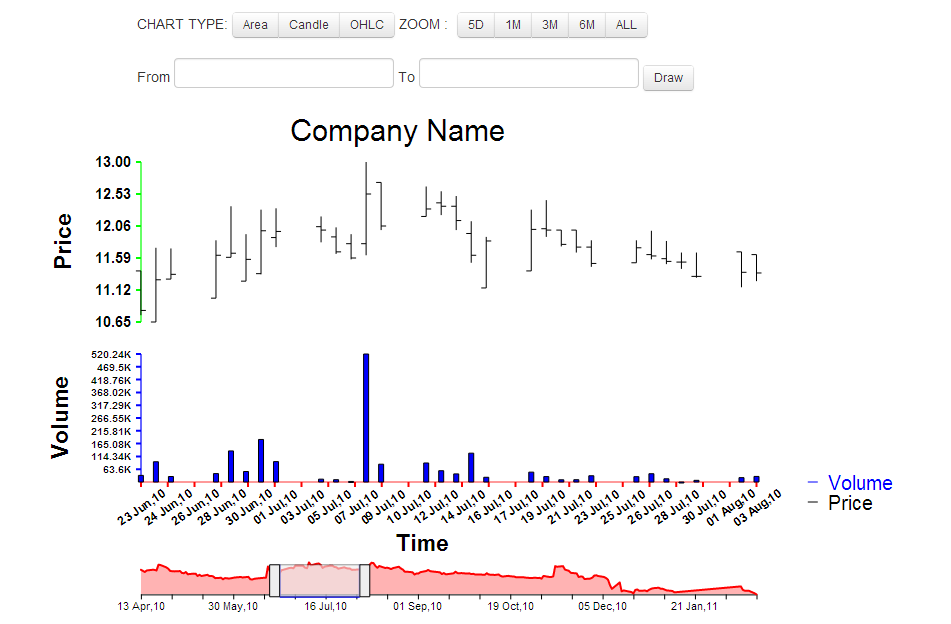 |
| OHLC type Chart |
 |
| Date Picker tool to select range |
 |
| Drag to Select |
Comments
Post a Comment